Temperature rise; cause and effect.
Temperature is fundamental to life on Earth and is the big driver of our climate. As temperature goes up it will clearly melt the ice cap glaciers, raising sea levels and impact upon precipitation and drought. Why the temperature is going up is not hard to understand and is covered in in another section. http://globalwarmingsimplified.weebly.com/
The important questions are, by how much, when, and for New Zealanders what about us?
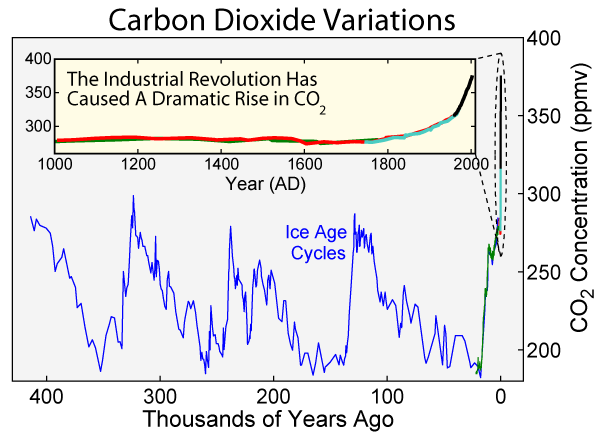
The first part of the question "by how much", depends on the amount of carbon we put in the atmosphere. we have increased the CO2 content in the atmosphere from its normal range of between 180 ppm and 280 ppm to over 405 ppm.
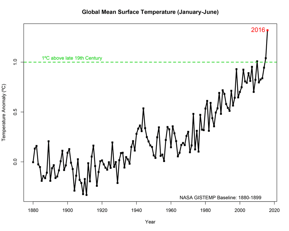
The following chart from NASA's Goddard institute, shows where the temperature is today and the annual fluctuations since the start of the industrial revolution.
Effectively the temperature started to rise during the industrial revolution when industry was driven by coal fired steam engines and the land was cleared for large scale farming.
The graph is not smooth, it is influenced by volcanoes and coal burning that reduce the temperature by putting sulphur and ash in the atmosphere, and the El Nino and La Nina cycles that have a positive and negative effect.
Although water is the major greenhouse gas and is very important, its effects appear to be self balancing because as the atmosphere warms and holds more moisture it acts as a warming gas but the increased cloud cover reflects heat back into space.
There was pause in the rate of temperature increase from about the year 2000 to 2015 which was due to the periodic distribution of heat in the oceans. The oceans absorb 90% of the suns heat but eventually returns it back into the atmosphere.
Graph by NASA
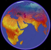
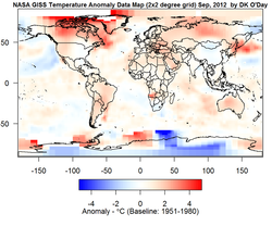
The increasing temperature is not spread evenly around the World but there is a larger increase at the poles.
The increasing temperature is not spread evenly around the World but there is a larger increase at the poles.
The Outcome.
What we don’t know precisely is how quickly and by how much the temperature will increase. This is largely determined by how much fossil carbon we burn in the future and how quickly the CO2 which is already in the atmosphere has an effect. There is a time lag of 20 to 40 years between the production of CO2 and the resulting increase in temperature.
From the graph below (Wiki) you can see how far we have deviated from the natural cycle.
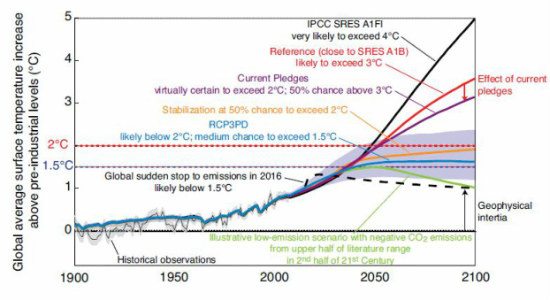
The IPCC scientists made an assessment of the temperature which would result from various levels of CO2 in the atmosphere but unfortunately completely underestimated the future rate at which we would burn fossil fuels.
We are currently running above the IPCC worst case scenario and still accelerating with no prospect of getting it under control as you can see from the chart by the World Bank below.
We are currently running above the IPCC worst case scenario and still accelerating with no prospect of getting it under control as you can see from the chart by the World Bank below.
3C increase in teperature is a Big Deal
A 3C increase in temperature would bring massive challenges to farming and food production.
New Zealand's place in all this.
Firstly, because we are a maritime country we have a temperate climate which is modified by the Oceans and we do not suffer the extremes of the large continental land masses.
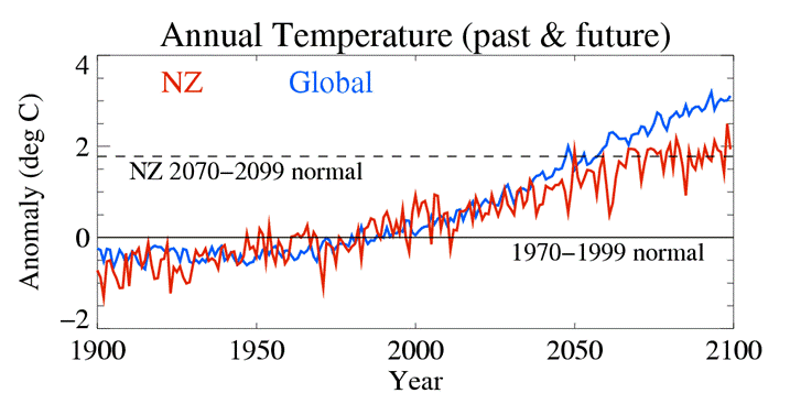
This is what New Zealand’s NIWA is predicting for our climate.
Firstly, because we are a maritime country we have a temperate climate which is modified by the Oceans and we do not suffer the extremes of the large continental land masses.
This is what New Zealand’s NIWA is predicting for our climate.
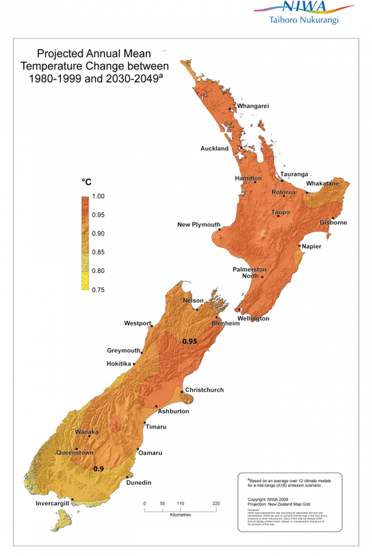
On a more regional basis,National Institute of Water and Atmospheric Research of New Zealand (NIWA) are predicting temperature rises (as described in the following illustration} for the period 2030 - 2049. The NZ Government has opted to adopt the middle CO2 scenario, although we are already tracking above the worst case scenario which has been highlighted in red.
2050 projected annual temperature change (°C) for each Regional Council by emissions scenario (mean [low, high]).
Regional Council B1 Scenario A1T/B2 Scenario A1B Scenario A2 Scenario A1FI
Northland 0.6 [0.2, 1.2] 0.8 [0.3, 1.5] 0.9 [0.3, 1.8] 1.1 [0.4, 2.2] 1.3 [0.4,2.6]
2090 projected annual temperature change (°C) for each Regional Council by emissions scenario (mean [low, high]).
Regional Council B1 Scenario A1T/B2 Scenario A1B Scenario A2 Scenario A1FI
Northland 1.3 [0.6, 2.7] 1.7 [0.7, 3.5] 2.1 [0.9, 4.1] 2.5 [1.1, 5.0] 3.0 [1.3, 5.9]
As research and lack of action continues the lower estimates are disappearing and we only have the upper estimates to deal with.
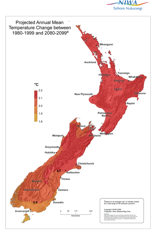
Below is the NIWA temperature forecast map for two periods, the middle of the century and the end of the century.
The NIWA red map on the right forecasts a 5.9c temperature increase by 2090.
To repeat, the situation is much worse than the government scenario, we can expect this temperature situation ten or twenty years earlier.
To repeat, the situation is much worse than the government scenario, we can expect this temperature situation ten or twenty years earlier.
The graphic illustration below shows how the temperature has soared in the last thirty years and, as it is done by regions, you can see that the Pacific region is fairing relatively well, probably due to the maritime influence of the small islands.

